


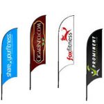
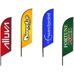
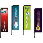


Once you decide that a banner or sign is the way to go for your business (and we think that’s a great idea!), it’s time to get designing. At SK Displays we want your design to create maximum impact, because we know how important it is to get the right message across, so we’ve provided some top tips for effective banners and sign designing below.
Will they see it?
It’s important you consider where the sign or banner will be and who you want to see it. This will determine the size and design specs needed. Think about if people need to see it from far away, if its inside or outside, and if there are any obstacles in the way to avoid last minute problems.
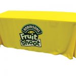
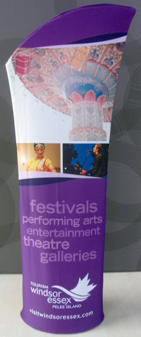
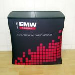
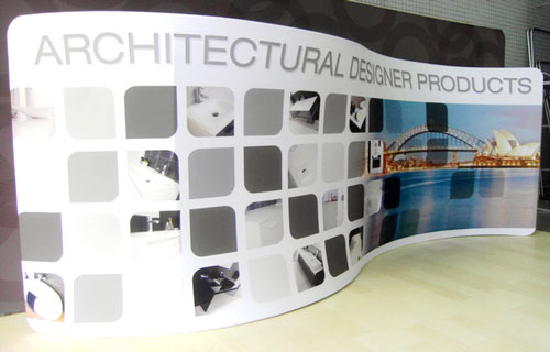
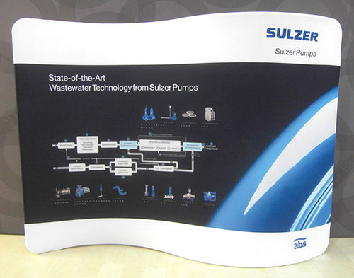
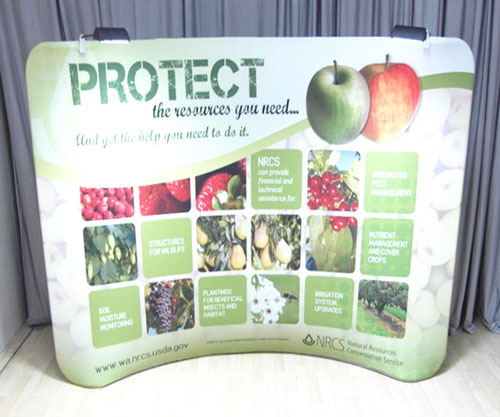
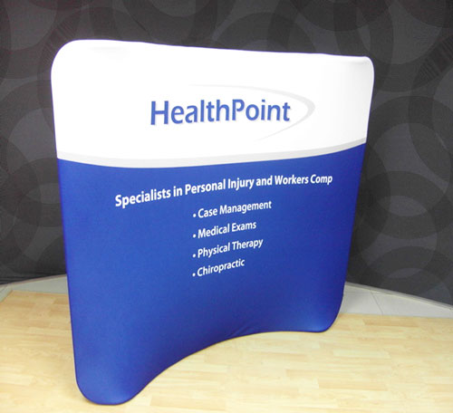
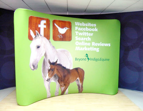
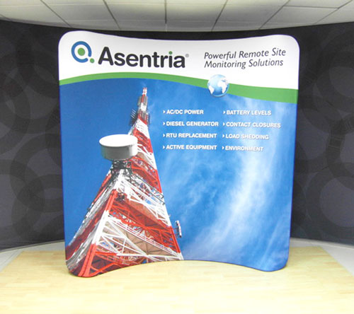
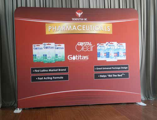
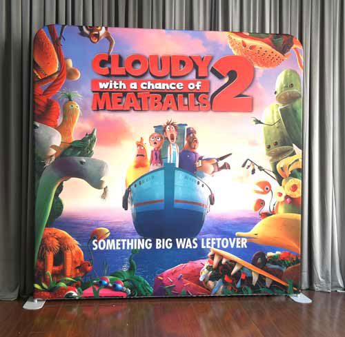
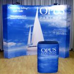
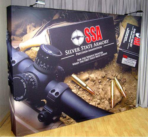
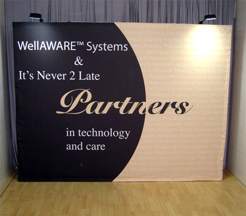
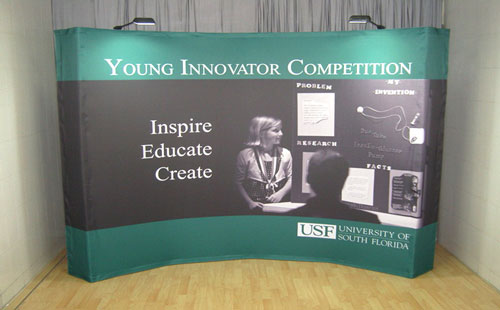
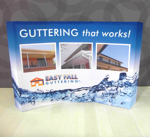
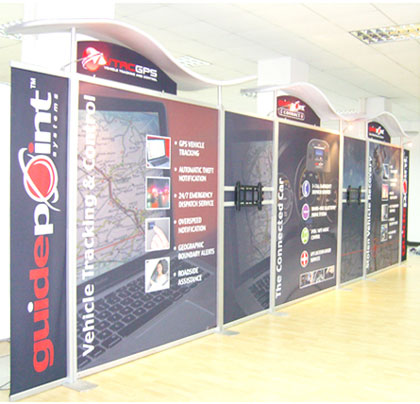
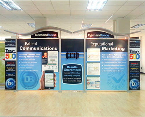
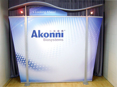
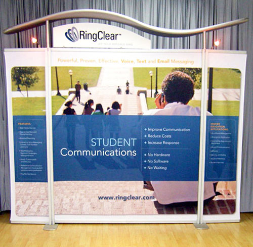
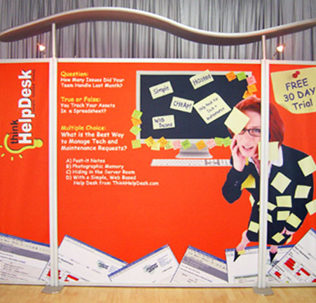
Is it clear? To ensure people get your message quickly you need to make the signage clear. This can mean applying a ‘less is more’ policy to make it stand out. Too much happening on your sign or banner can detract from the true message you want to relay. Try a 40% text, and 60% blank space approach for the best result.
Is it legible? The font you use will be vital to readability from both a distance and close up. It also helps to limit your typefaces to just one or two complementing and clear fonts.
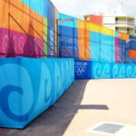
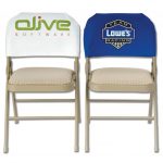
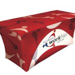
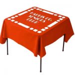
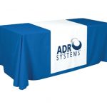
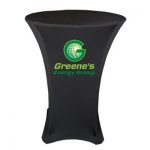
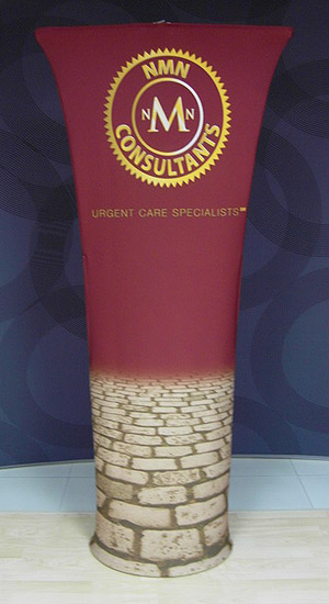
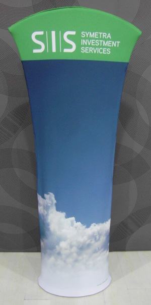
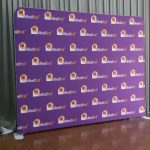
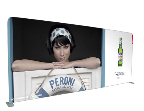
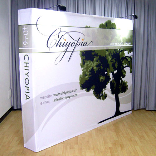
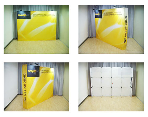
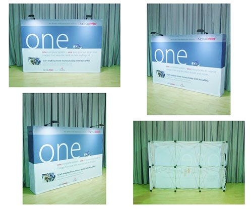
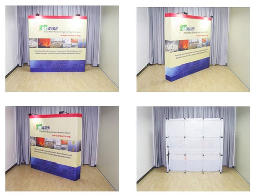
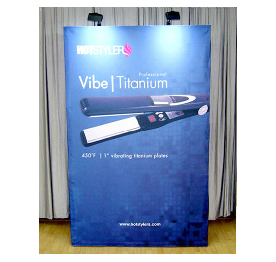
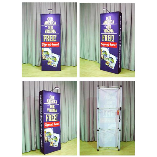
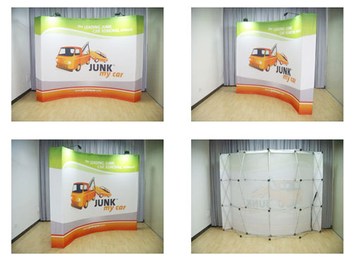
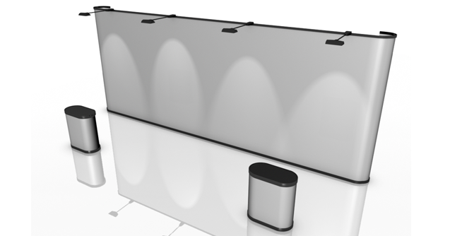
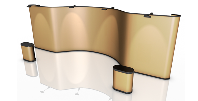
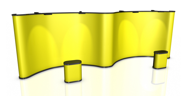
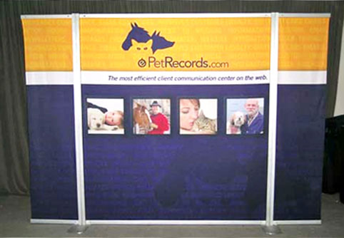
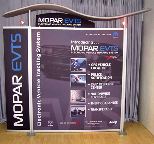
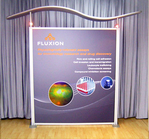
Which colours? Colour has a huge impact on marketing, and limiting colours to just two or three contrasting colours in your design will help it be clear and easy to view, which will make it stand out. Add a bright colour for contrast, or use a simple photo as the background. Just make sure not to over-complicate the design. By keeping the design simple and clear, you can create great signs and banners that will generate maximum return on your investment. Don’t forget to have fun with the design process and ensure you to company branding. And of course if you need help any step of the way, check out our fabric printing services here and contact us today.